

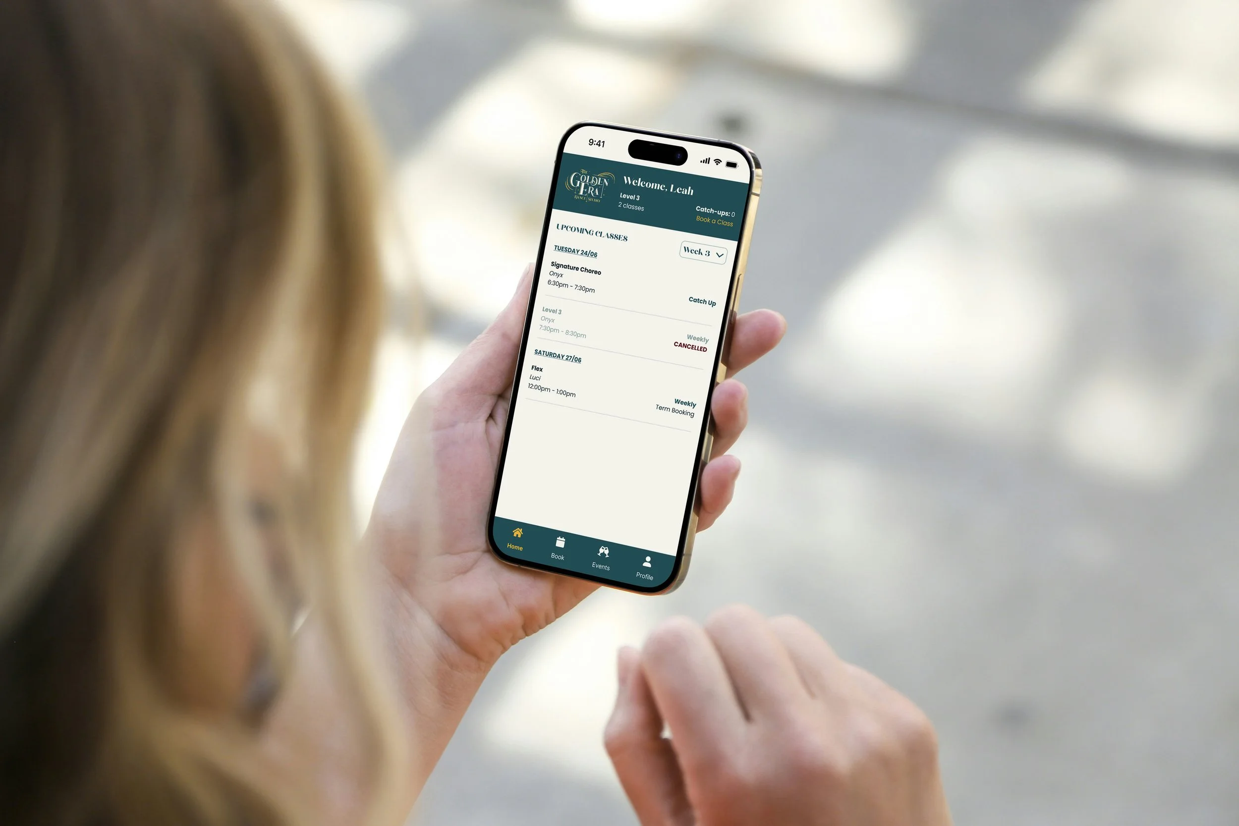
What I did:
Branding
Research
UX/UI
Prototyping with Cursor AI
Overview:
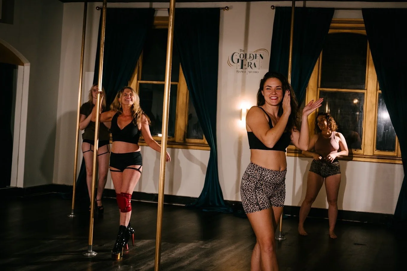
Out of witnessing the frustration of the students and teachers with the current app that my dance school uses, I decided to take on the challenge of designing an improved app booking experience.
Designed for multiple user groups - both students and teachers, the project focuses on simplifying class discovery, clarifying pricing, and streamlining term enrolments through a user-centred, mobile-first experience.
Interactive Prototype:
“More time dancing, less time being confused about how to book and whether I’m on a waitlist or not.”
Design Process
01
Research
Competitor Analysis
Personas
Moodboarding
02
Wireframe
Logo Design
Typography
Colours
03
Design
User Flows
Wireframes
Design System
04
Test
Prototyping
Usability Testing
Iteration
The Problem
Students and teachers spend too much time navigating the existing dance class booking app. Confusing processes, constant notifications and a frustrating enrolment experience create unnecessary friction.
The Goal
To reduce enrolment-related help requests to the studio owner to zero, reducing the time she spends on administration while creating a simple, intuitive enrolment experience that encourages more students to enrol.
The experience needs to:
allow students to quickly and easily book classes for the term, casually or be added to a waitlist.
not overwhelm the user with constant notifications and emails, drowning out the notifications and emails that actually matter.
present their dance class options at a glance.
keep track of their classes.
consistent with the existing branding of the dance studio.
Research
Goal
Understand the main frustrations with the current app, Groovio, and what needs to be improved.
Method
To understand the core requirements of the app, I conducted an audit of the current app, noting what I found difficult to use and where I felt the experience could be improved. I then interviewed others who had tried using the app, including the studio owner and other students, to supplement my ideas. I also looked at other apps such as ClassPass, Humming Puppy and Pole & Aerial Divas Melbourne, going through their booking flows to see how they had approached it.
In addition to interviews and audits, I also created a User Journey map of the current app, to break down the core flow experiences that users were typically unhappy with, and to identify potential ways to improve the experience.
Findings
The current app had multiple different ways of getting to the same screen
Broken functions
“Book Waitlist” immediately brings up a modal where the primary button is “Leave waitlist”, causing users to accidentally leave the waitlist immediately
Too many steps involved in cancellation, a frustrating process
3 different lists of classes, clicking one only lets you book, another only lets you cancel, resulting in users frantically trying to navigate to the function they want.
Waitlists did not put you on the waitlist for the specific week that you’d selected, but a general waitlist that ran all term, often meaning that users would accidentally book into the wrong week when they received a notification that a spot had opened up.
Difficulty visually seeing the classes that you were enrolled in for that week.
A lot of “tell and not showing”, forcing the user to slow down and read the app slowly and try to figure out how to use it.
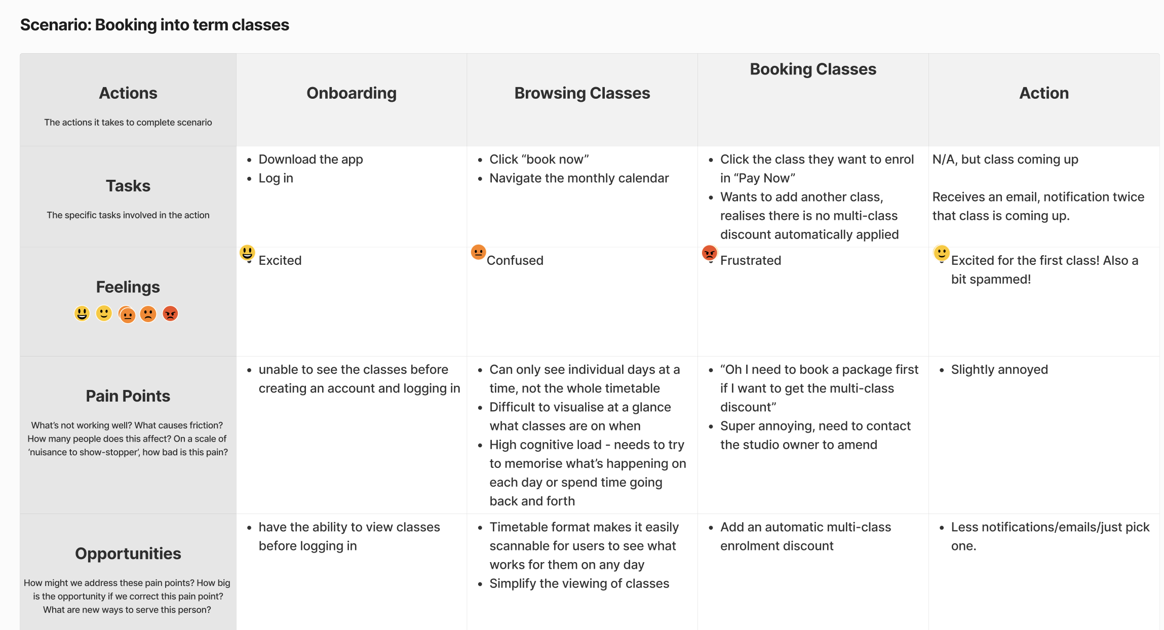
The Student’s experience
User Flows
Goal
To lay out the of core flows that I want the app to be able to handle, allowing me to prioritise which flows are the most important for creating the minimum viable product.
Method
I find that my most productive and creative methods of working use both digital and physical tools together. I used pen and paper to write out and brainstorm the flows that I absolutely wanted to have in my app, as well as give me a physical list to refer to and tick off whilst working.
Since the flows seemed fairly straightforward, I used pen and paper to draw them out as well, and transferred them to Miro later to have a digital copy as well.
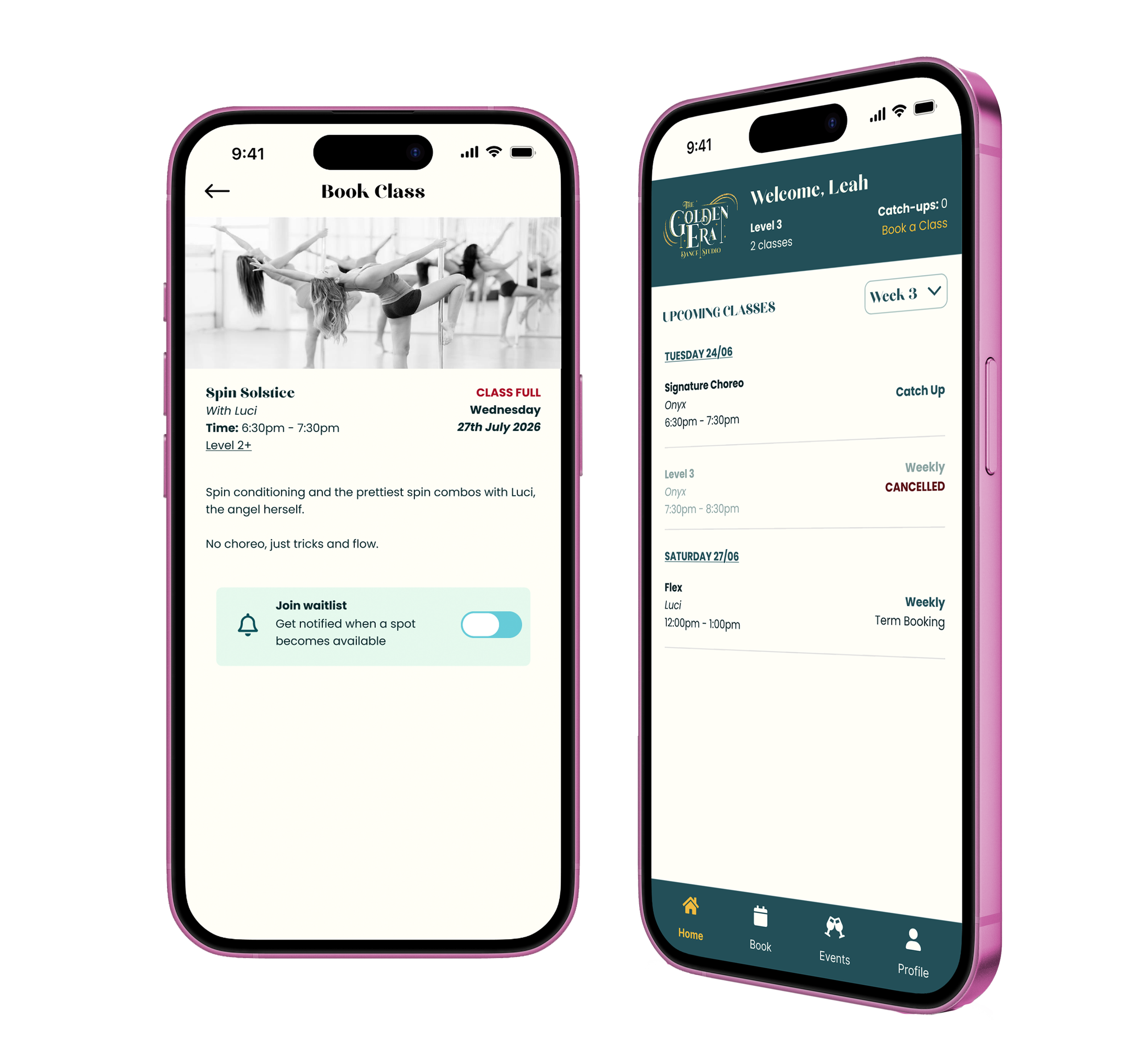
Prototype - Book Class
Wireframes & High-Fidelity Screens
Goal
Create the layout for the UI of the app, figuring out the hierarchy and information architecture before moving on to high-fidelity screens.
Wireframes
Created in Figma to trial ideas for the information hierarchy quickly.
Design System & Components
I established a reusable component system in Figma covering navigation, buttons, cards and form elements, allowing the interface to remain consistent across the core booking flows.
Prototyping
Goal
To prototype the main user flows to prepare to do some usability testing.
Figma
Prototyped the core user flows in Figma.
Prototype - Add Class to Waitlist
Usability Testing
Goal
To refine the design of the main user flows, ensuring that they are on the right path as early as possible. I’d created prototypes for the main flows: booking a class, cancelling a class, being on the waitlist
Method
Qualitative usability testing with two participants, one who had never seen the app before, one who had used dance studio booking apps previously.
Gave them a series of tasks to complete, the core user flows that I had wanted.
Wrote the findings down in my notebook - ideally I would have filmed the process, but I had kept it casual in this setting to better reflect the actual circumstances in which the user would be using the app e.g. on the go in a cafe.
| Findings | What Changed | Impact |
|---|---|---|
| Easily able to book classes | ||
| Waitlist was tricky to understand, with not enough visual feedback, I was struggling to design this part, so just testing what I came up with early gave me direction. | Added a toggle to the waitlist, rather than just a button, and a notification | Users could much more easily understand they had joined a waitlist |
| Users navigated cancellation differently, some using the "week" button in the top right corner to navigate to the week first, and another clicking the class for the "weeks" dropdown. | Having both ways to cancel classes makes sense, however navigating weeks with just buttons can be tedious, so adding a dropdown to scroll | Allow users to navigate to their chosen week more quickly |
| The table view was easily understood by the users, but having a list view was also suggested | Added a list view toggle, to allow for different views. Most booking apps that I looked at used list views, so it would match most users' mental models of how bookings work | Users can choose which view they prefer |
Integrating Teacher View
Cursor AI
Goal
To create the interface for the teacher side of the app, having it mirror the student side and allow for:
Attendance marking
Booking practice/private lessons
Viewing the timetable to see who had booked the studio when and ensure there were no clashes
Have private lessons automatically show up in the student’s dashboard as well
Method
Using Cursor AI to design for the first time, I found it extremely quick as the layout for the app was already there since I’d done it in Figma. Designing using Cursor also allowed me to prototype the interactions as I was designing, which was super exciting since I could simultaneously test my own designs.
To test the teacher view, click on the logo on the home page:
AI Prototyping
Using Cursor
Bringing the designs from Figma into Cursor has been game-changing. Being able to prototype interactivity and see the designs come to life in minutes is so exciting, and means that I can spend more time testing and creating even better designs.
Check out the prototype:
Reflection & Learnings
The importance of Usability Testing
Seeing people use early versions of the prototype immediately allowed me to make adjustments and improvements that I otherwise would not have caught on my own. Since the app is designed not just for myself, but for all other students as well, it is critical to ensure the app meets the expectations of the users and makes their lives easier.
Prototyping
Prototyping in Figma early in the design process was invaluable to be able to really get a feel for the product and quickly iterate design ideas.
Designing for Multiple User Groups
I find it really fun and exciting to design for multiple user groups and integrate their interactions.
Using Cursor AI to quickly design an initial set of screens and flows was great as I could test my thinking as I was coming up with the designs. It’s good to have different tools and approaches that I can use for various aspects of the design process.
Success Metrics
The primary measure of success would be the reduction of the number of students contacting the studio owner for help with bookings, as well as increase the amount of students that enrol through the app.
Questions? Ideas? Let’s talk.
I'd love to hear your thoughts or chat about working together.
Also check out…
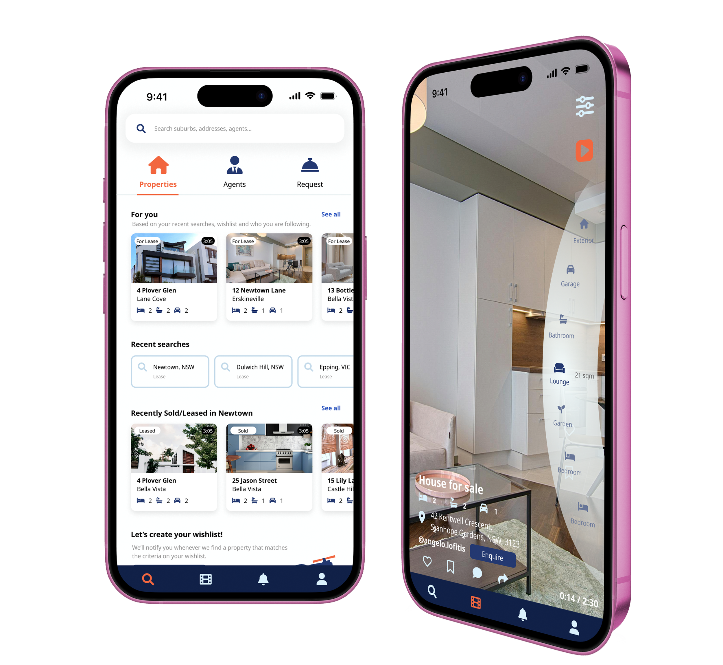
Inspected App Design
App design
SOLE UX DESIGNER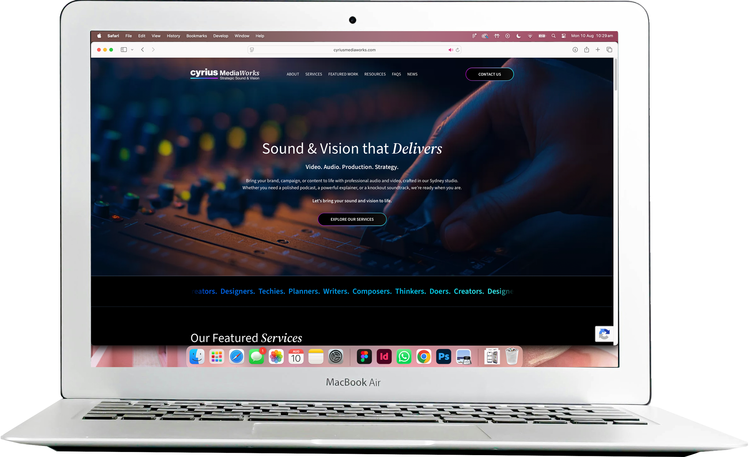
Cyrius MediaWorks Site Refresh
Web design
UI DESIGNER